A word that’s often thrown around in the halls of marketing is rebranding. As brands evolve and grow, there crops in the need for rebranding.
Chances are if you’re reading it – you too might be looking for it!
The curious case of rebranding is that it begins with a single step – i.e., from self. We, at Skootr, have been a strong advocate for change, always pushing the need to reinvent the Indian workspaces. Now, as the advent season of joy and new beginnings is upon us, we’re delighted to share the good news of us rebranding our identity while keeping our core philosophy of ‘Revolutionizing Indian workspaces‘ intact.
What Has Changed?
Logo
Skootr started as a BPO in 2007 before switching to seat renting in 2012. We ventured into the world of commercial real estate in 2013 and launched our very first owned space in 2016. The logo demanded a quirky outlook as it was designed to appeal to young entrepreneurs. However, with changing times and evolving market trends, the industry witnessed lots of changes in the way office spaces were perceived and acquired. We too experienced a renaissance of sorts. The new wordmark logo perfectly encapsulates the essence of the brand with our proposition ‘Redefining Offices’.
Tagline
The new outlook and the new audience set demanded a change in the proposition. ‘Kickstart your way’ was perfect in appealing to young entrepreneurs who wanted to kickstart their office operations in no time. With ‘Redefining Offices’, we’re reinstating our approach for large scale corporations to transform the real estate industry by delivering world-class experiences.
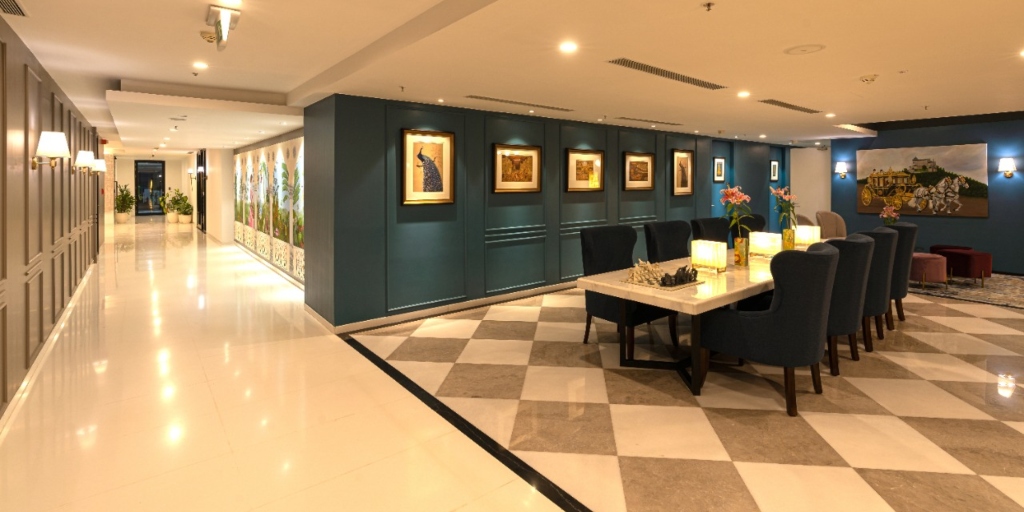
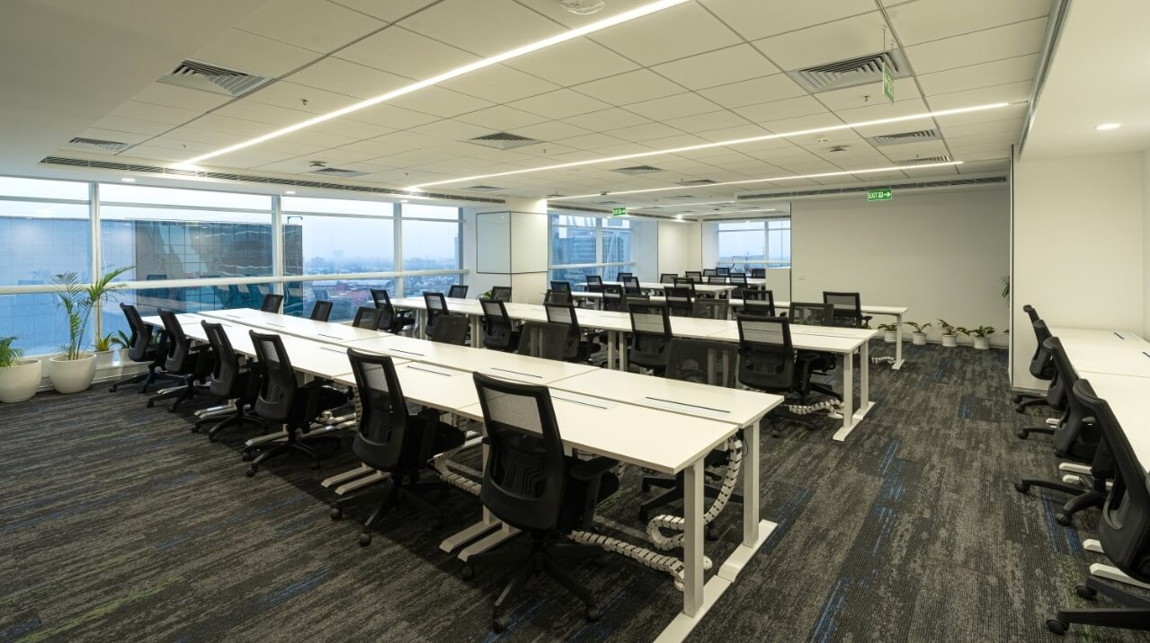
Skootr’s concept of ‘Premium Managed Office’ is a holistic package consisting of unparalleled facilities of Grade A properties, assurance of a hassle-free process without locking up growth capital in CapEx and saving on upfront costs while preserving your brand identity and culture with tailor-made solutions.
Colour
Do colours have emotions? Or do emotions have colours? Whatever be the case, one thing is for sure – their association is indispensable. The red logo was apt for our target audience as it perfectly tapped into their core emotions of passion and energy. However, in time we graduated towards the premium section of the segment. This transition required us to possess a more elegant and sophisticated identity. According to psychology, black is the colour of authority, elegance, and ultimate sophistication. Hence, the new colour scheme.
Typography
During the initial phase, we required a bold and traditional identity. The upper case letters represented our passionate, rigid and sometimes aggressive approach. However, over the years, we have become flexible and adaptable. The new logo with its round and smooth font in lower case letters is a testament of that.
What will remain the same?
Our passion. Our minimalist and robust workspace concepts will now have a perfectly complementing identity. We’re now more than confident that our holistic package of real estate, design, community management, state-of-the-art facilities and technological innovation will revolutionize the Indian commercial real estate industry in the coming time by increasing the productivity, cultivating innovation, increasing collaboration among peers and beautifully preserving the company culture and ethos.


